TruAbutment Digital Academy
website redesign
Project Type
Web Design
UX/UI Design
Banner Design
Photo Editing
Live on Website
UX/UI Design
Banner Design
Photo Editing
Live on Website
Role
UX/UI Designer
Graphic Designer
Graphic Designer
tool
Figma
Adobe Illustrator
Adobe Photoshop
Adobe Lightroom
Adobe Illustrator
Adobe Photoshop
Adobe Lightroom
Overall CONTRIBUTION Rate
Sole designer — end-to-end execution
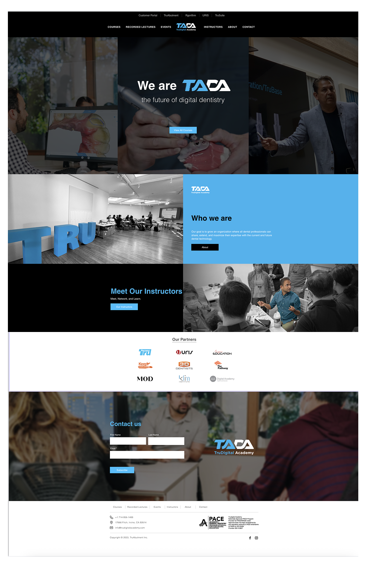
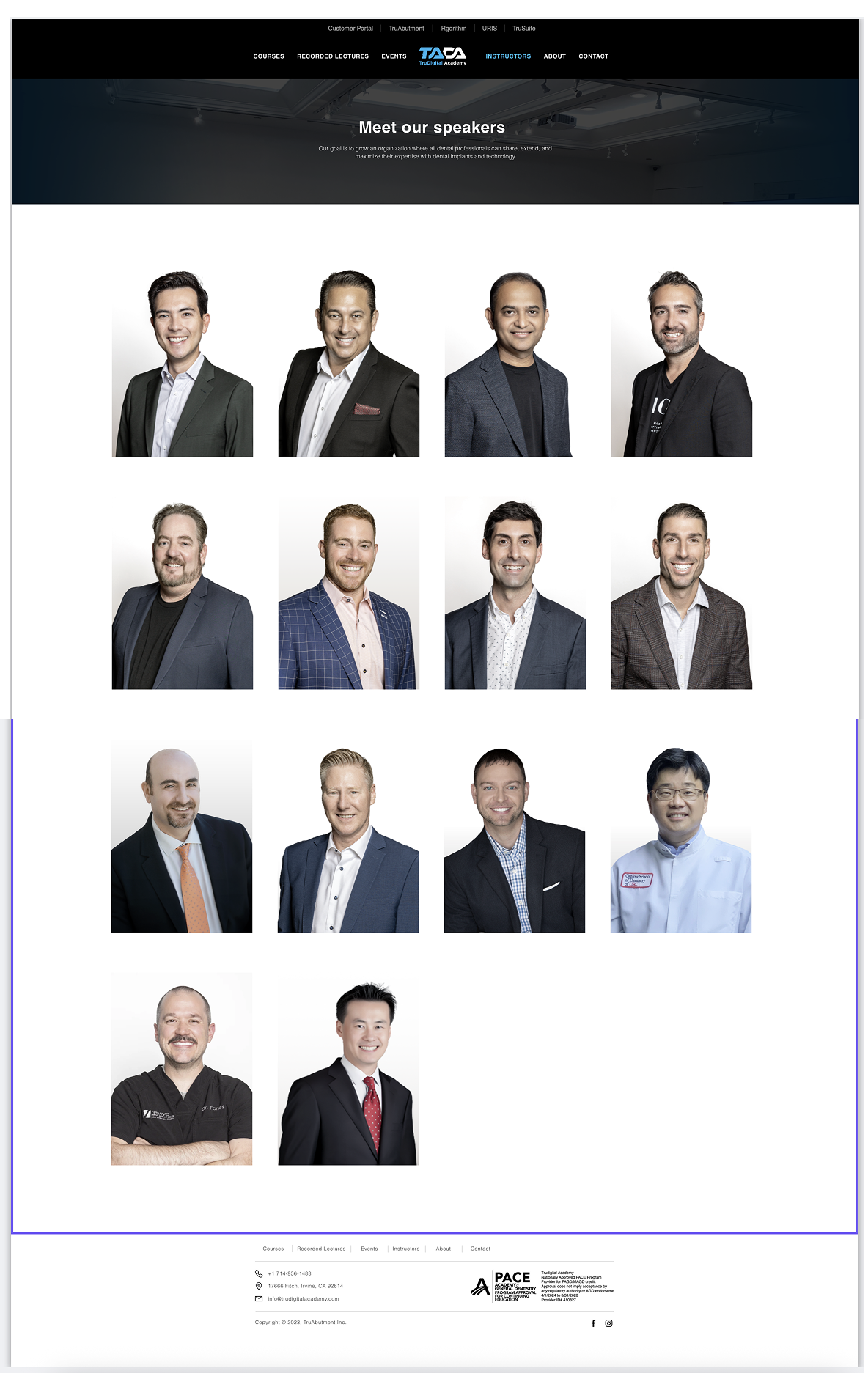
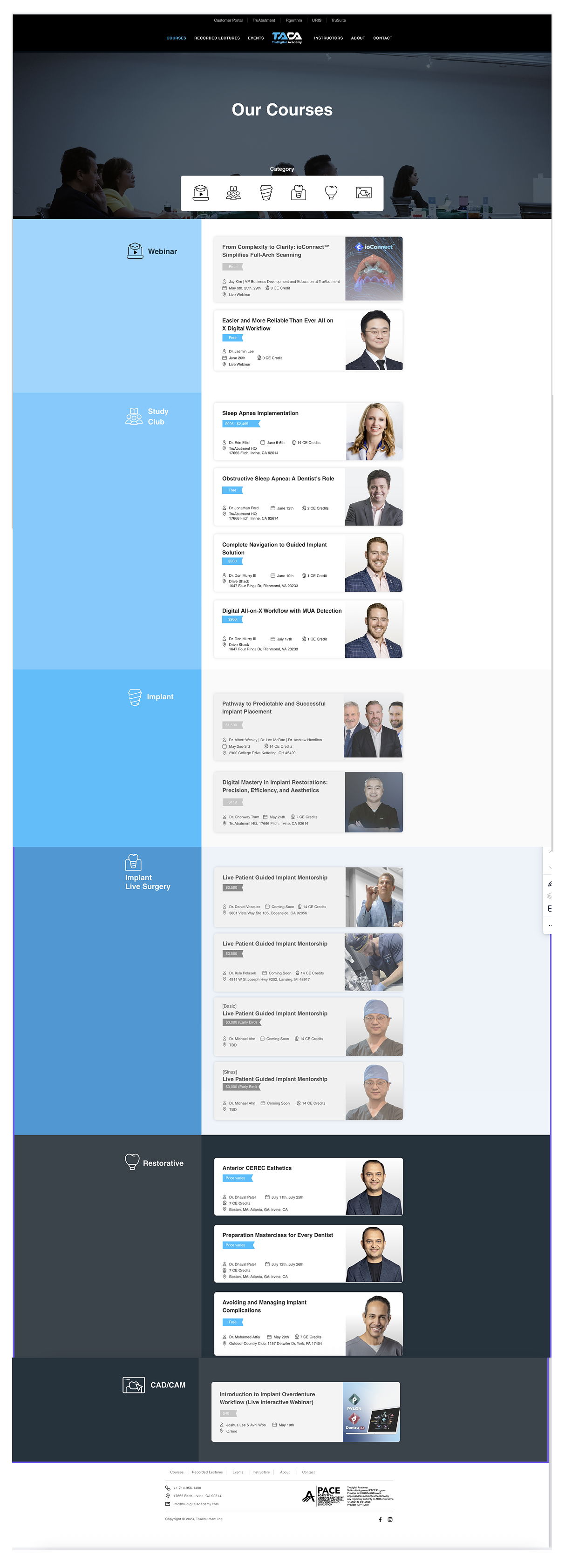
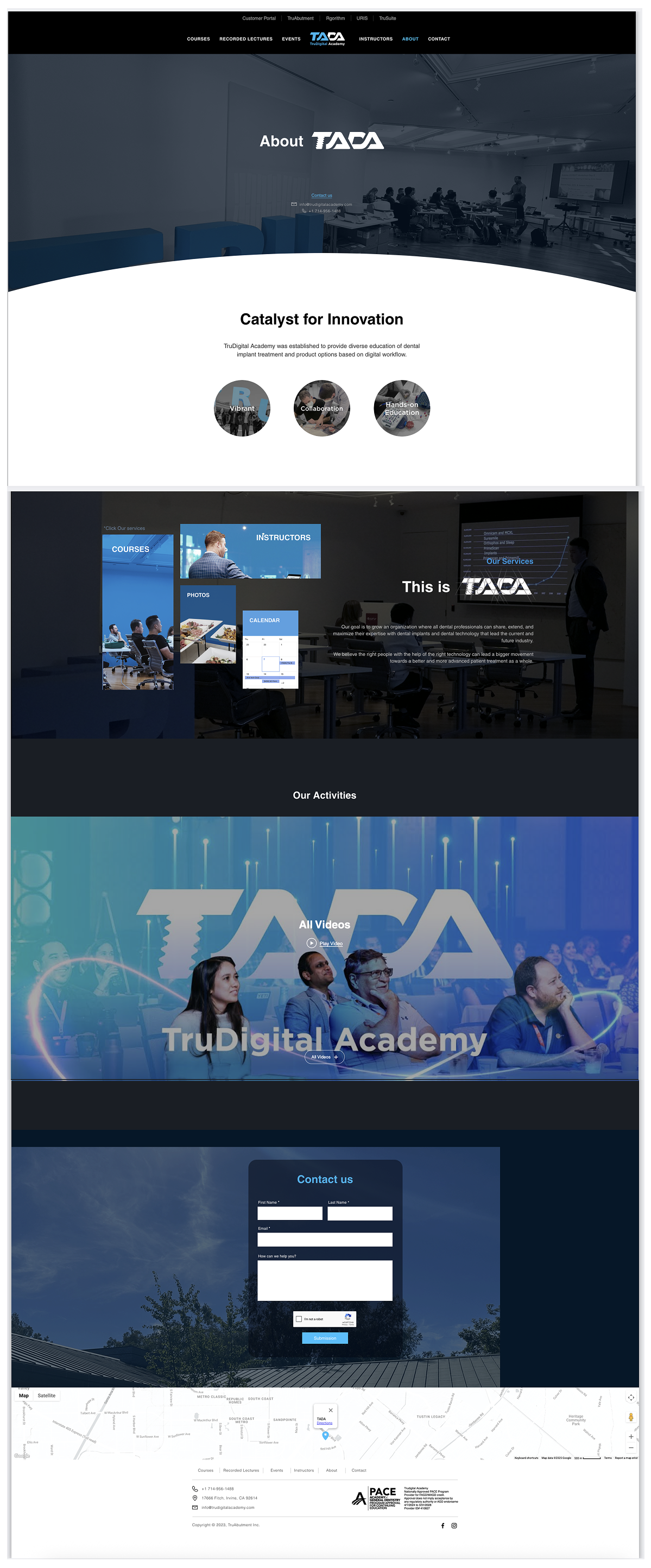
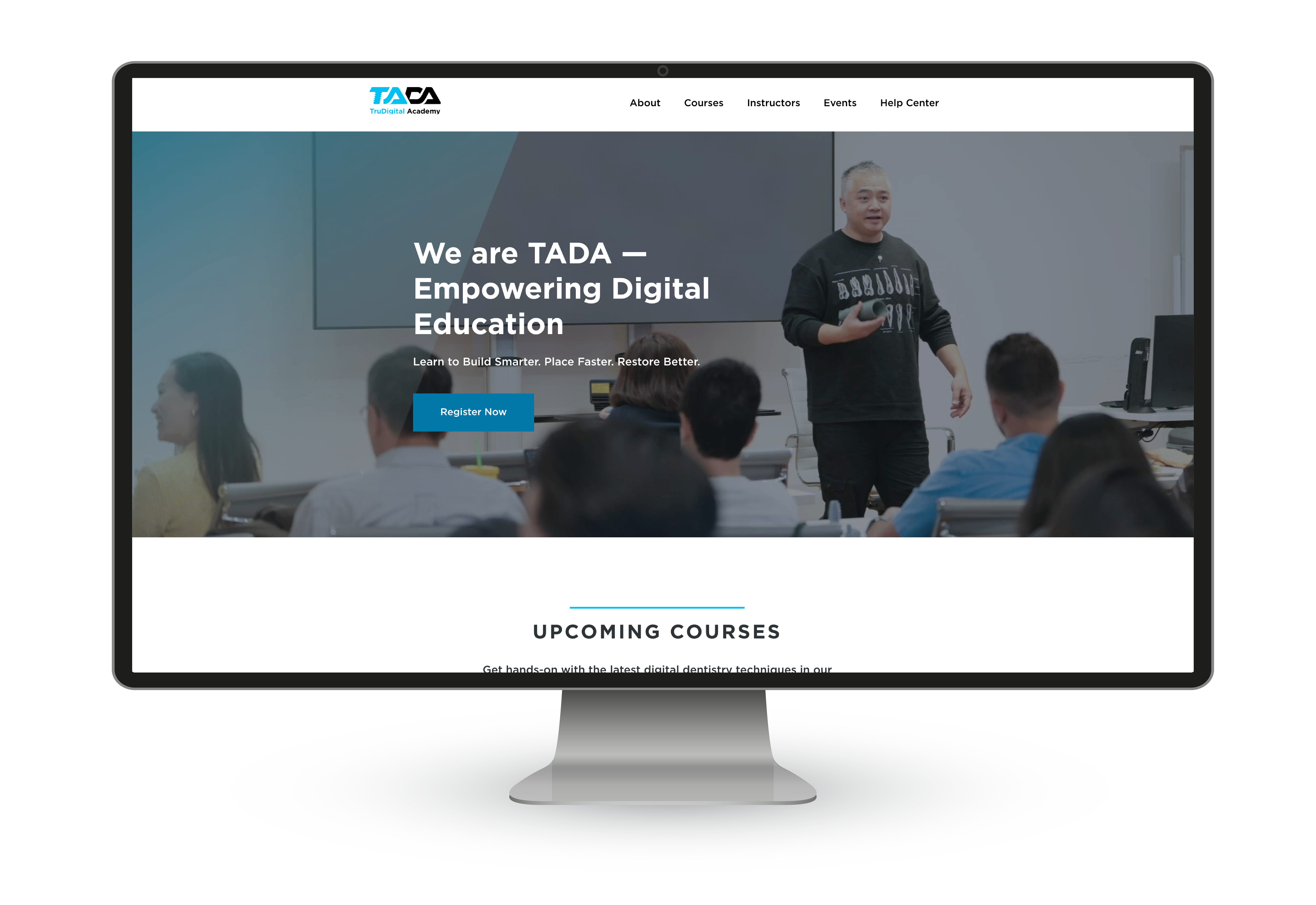
The TADA (TruAbutment Digital Academy) website hosts hands-on and on-demand education in digital implant dentistry. I led the end-to-end redesign — restructuring the sitemap through card sorting and competitive analysis, establishing a cohesive design system, and implementing on-demand courses directly accessible on the platform. The goal: make course discovery and CE credit retrieval faster and more intuitive for busy dental professionals.
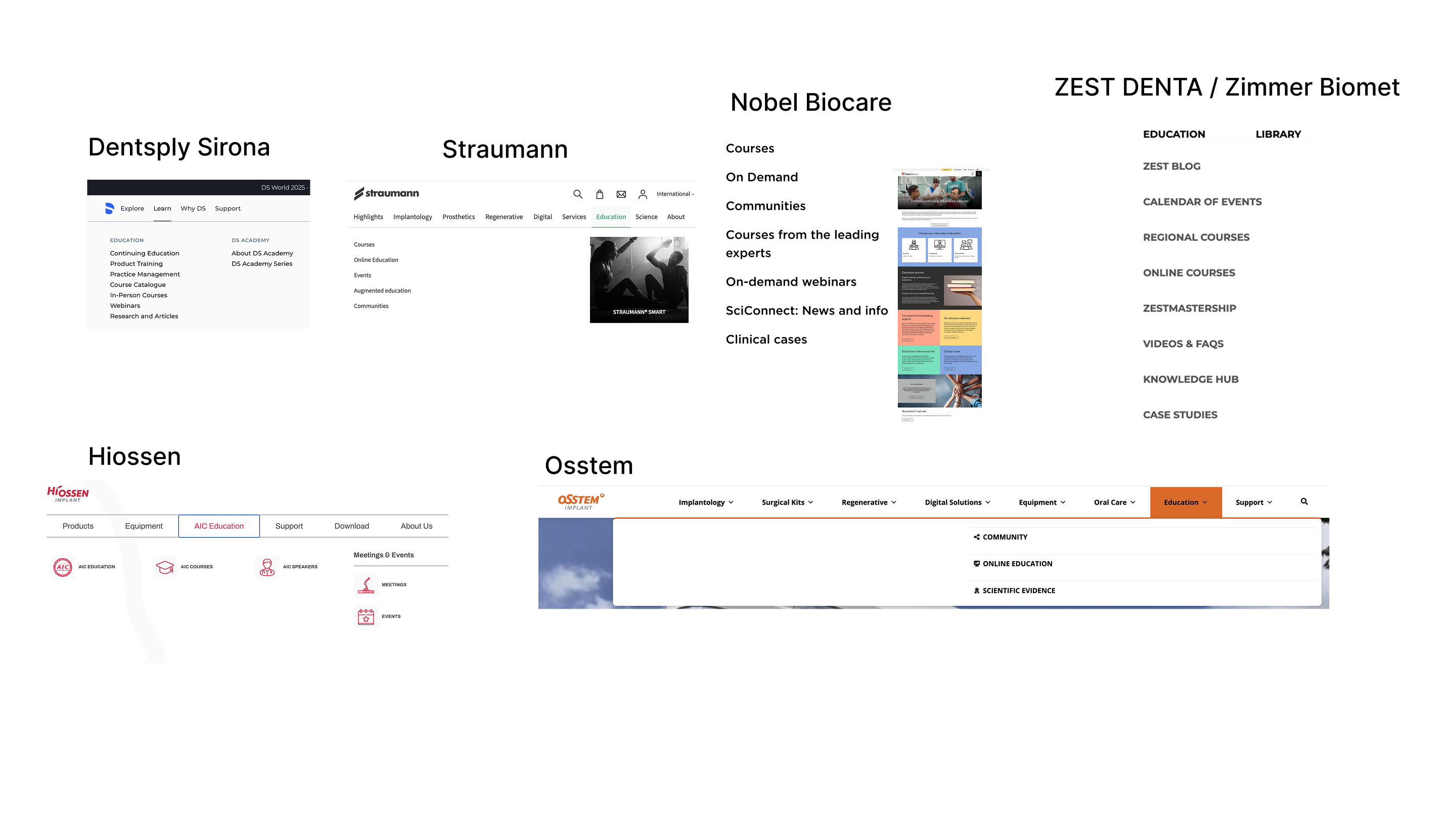
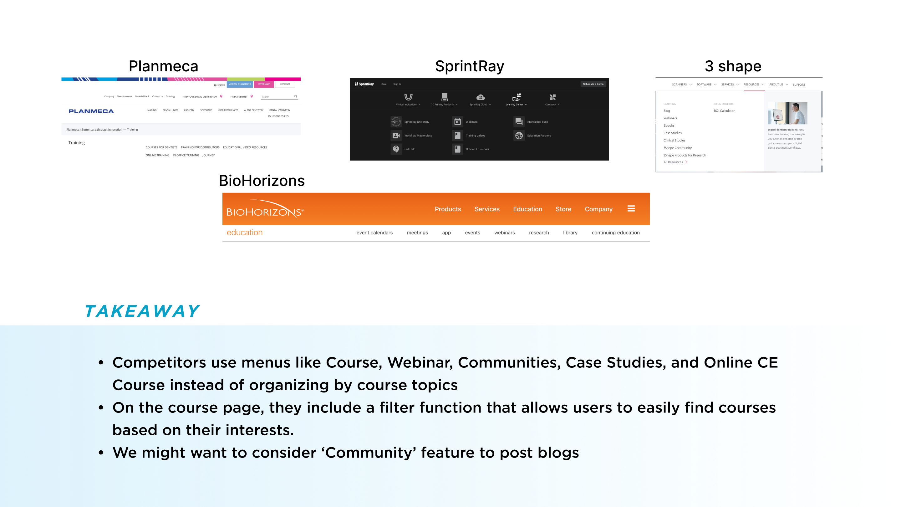
Competitor analysis
card sorting

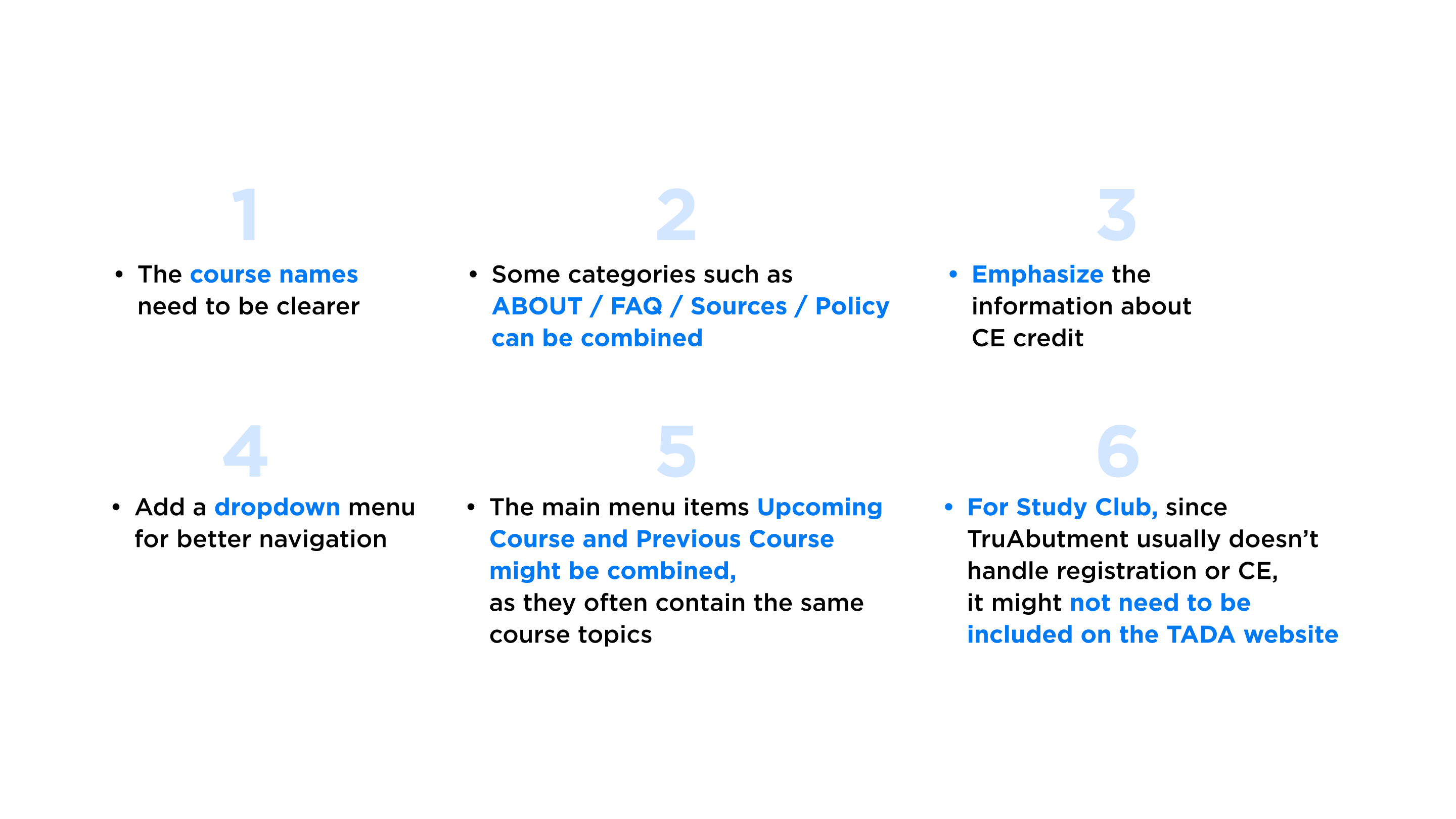
One of the key challenges in restructuring the sitemap was determining how to categorize the courses and what information should be prioritized in the user interface. To address this, I utilized a card sorting tool, allowing team members to group courses based on their own mental models. These insights were then used to define and refine the category naming system.
Building on this, I conducted a competitive analysis to understand how dental courses were structured across other platforms, and actively collaborated with the team to validate and finalize the menu structure. This was not a one-time decision but an iterative process—refining the sitemap continued throughout the duration of the website redesign to ensure it remained clear, intuitive, and effective.
In particular, courses were divided into separate pages for In-person and On-demand formats. This distinction allowed users to easily differentiate between courses that require physical attendance and those that are freely accessible online at any time, improving clarity and overall usability.
site map /
Information Architecture
Information Architecture
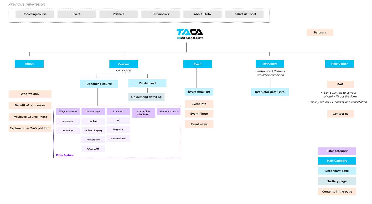
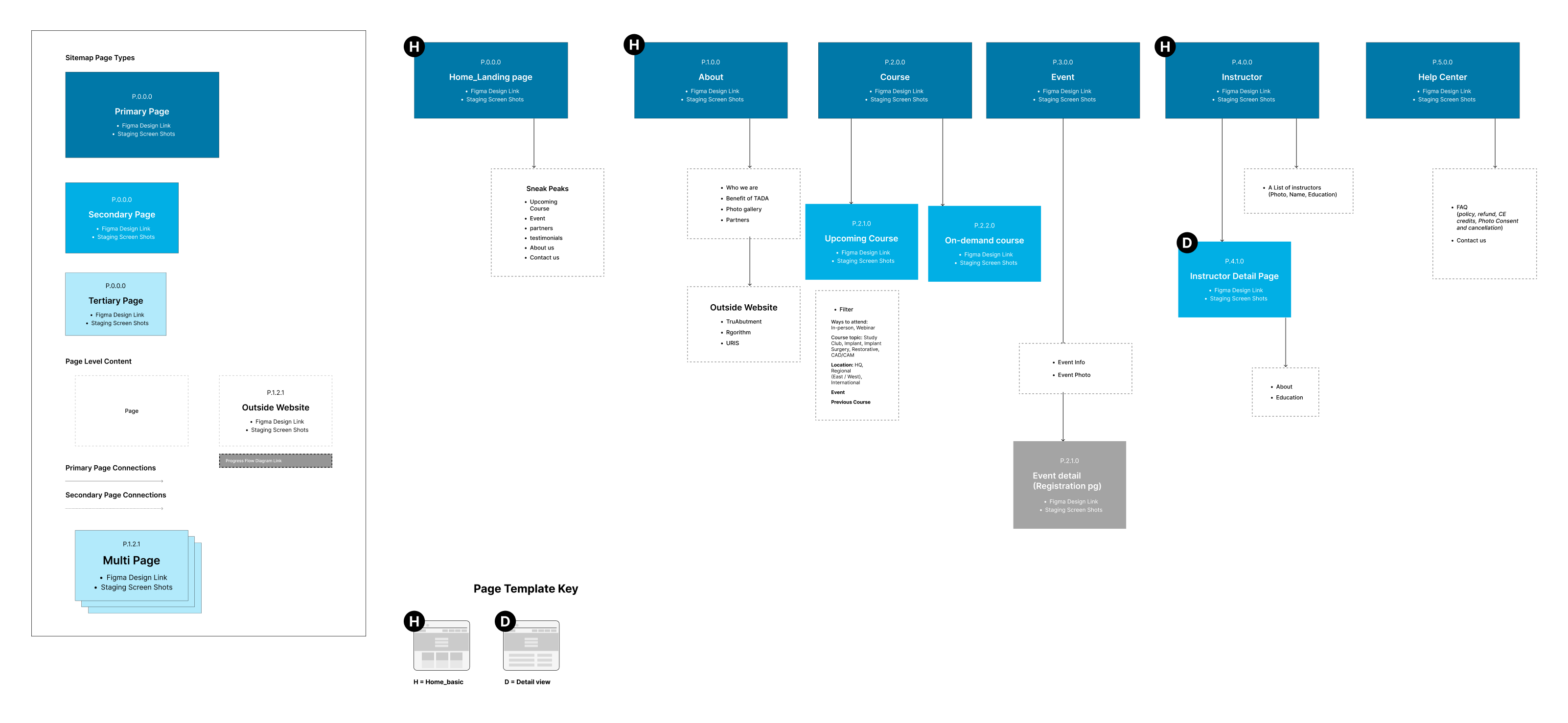
As part of the website redesign, the first priority was to identify and clearly define the existing issues. I began by restructuring the sitemap to better understand where users were experiencing friction and to evaluate whether the site was effectively serving its intended purpose. Through collaboration with the team, we redefined the course categories and focused on identifying key pain points in the user experience. In particular, we prioritized improving the delivery and structure of information related to the core objective—Education Courses—ensuring a more intuitive and efficient user journey.

Persona
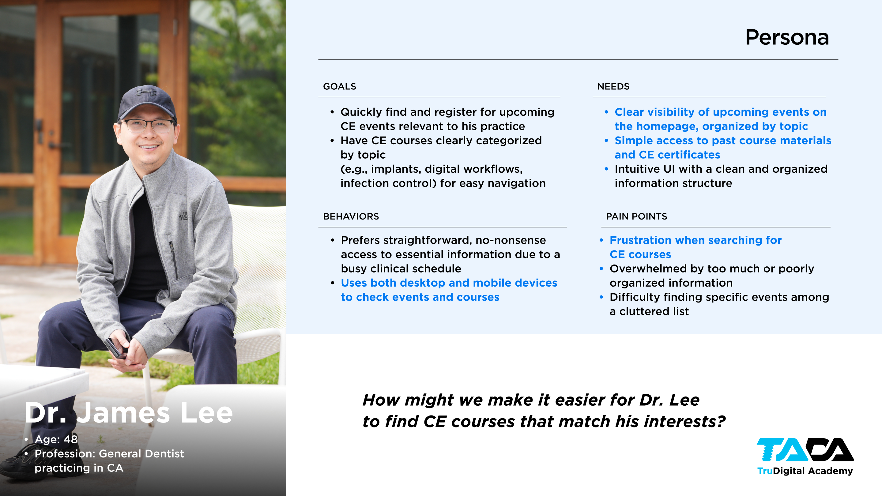
The primary users of the site are professionals who visit with two clear goals: to explore upcoming events and courses, or to obtain CE credits from past events. They value efficiency and clarity, often seeking quick access to relevant information without unnecessary complexity. This persona prioritizes easily discoverable, well-organized content—particularly upcoming courses categorized by topic—so they can quickly identify opportunities that match their interests or requirements. At the same time, they expect seamless access to past event materials in order to complete or retrieve CE credits. Overall, their behavior is goal-oriented and time-sensitive, making intuitive navigation and clear content hierarchy essential to their experience.
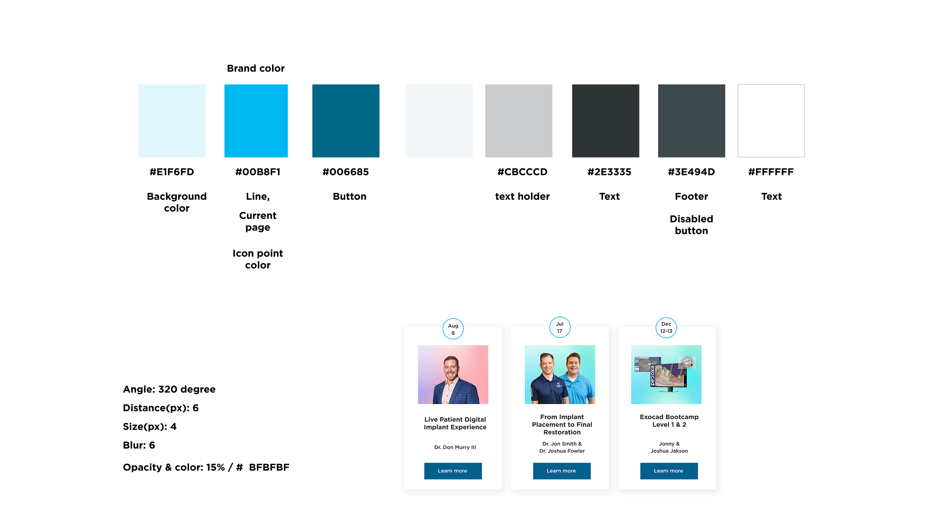
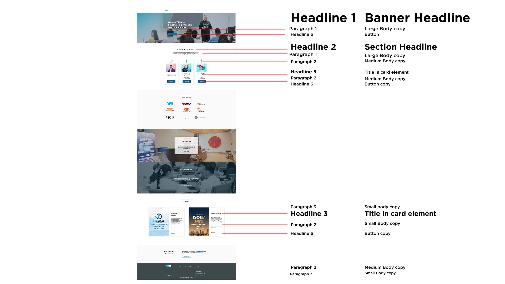
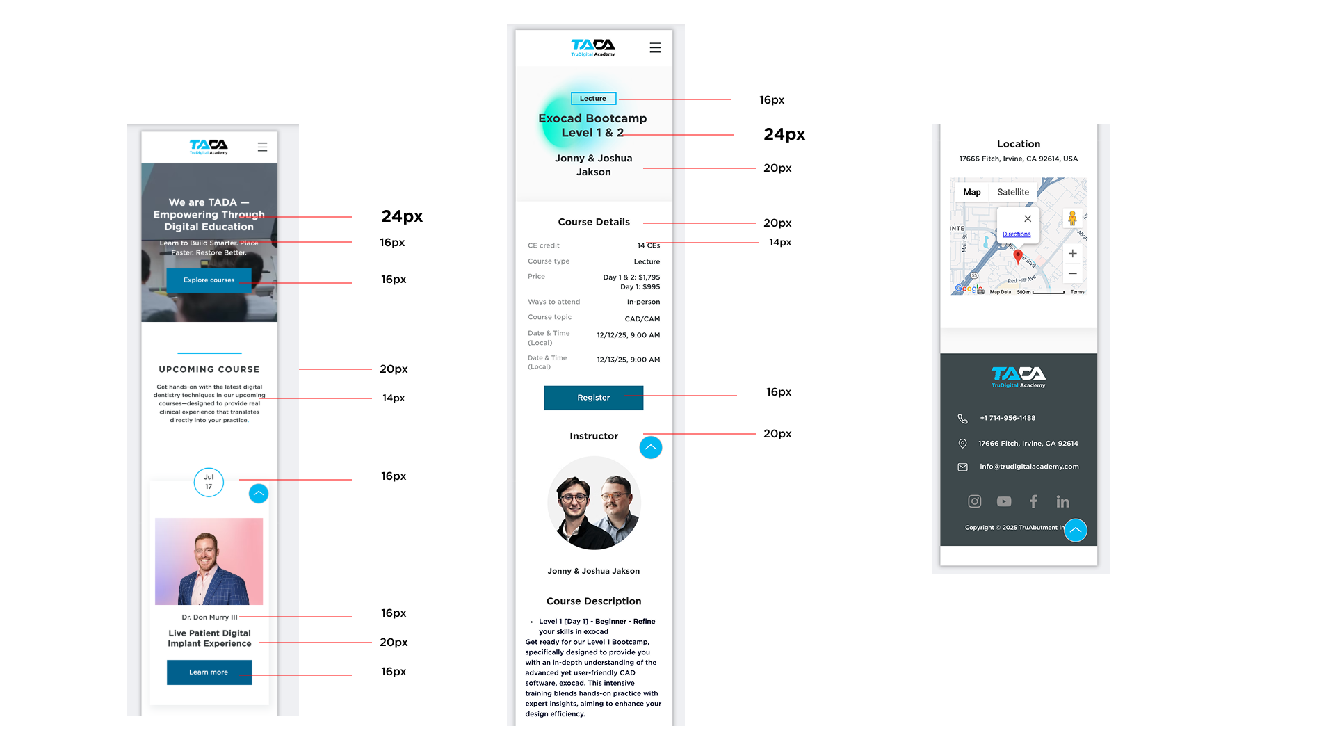
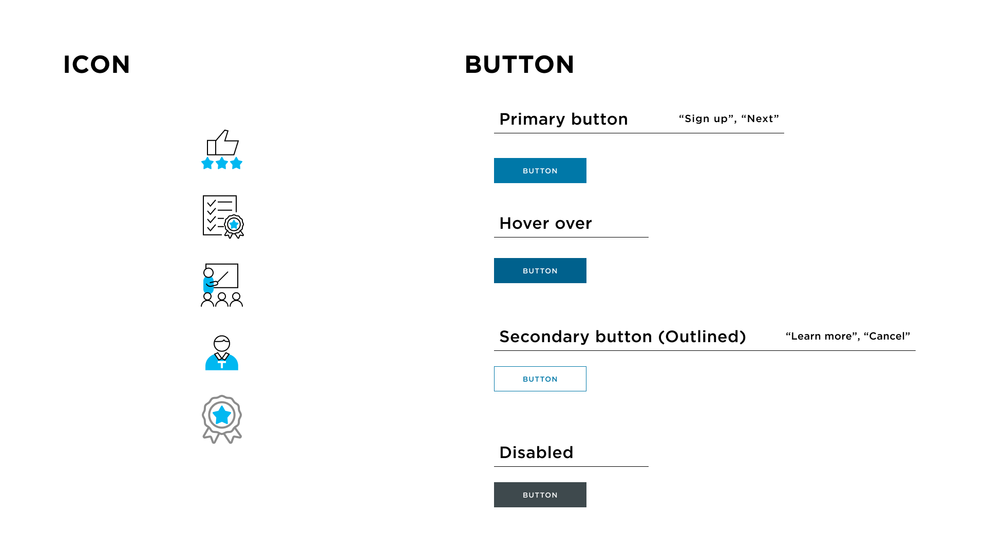
Design system


key achievement

Before