TruSuite Launcher
One hub for every dental workflow.
TruAbutment's software launcher, rebuilt end to end — from information architecture to a cross-platform design system. Scroll to see how it came together.
Download the launcher ↗A centralized dental application hub — streamlining workflows from implant planning to 3D printing. I led the digital workflow strategy, enabling users to seamlessly download, manage, and customize applications based on their clinical needs.
- Lead Product / UX Designer
- Feb – Jul 2026
- 1 designer + dev team
- Windows · macOS desktop
- Shipped & live · Jul 2026
Live for a month — and already sticky.
Early signals from the first month post-launch — Aug 1–28, 2026 (GA4).
I led the project and guided another designer while running biweekly syncs with the overseas dev team. Because v1 was already live, understanding what was technically feasible — and why past decisions were made — was key to moving fast without breaking trust.
The whole launcher, rethought.
Same product, rebuilt end to end — from a crowded tool-dump into a calm, guided home.
Analytics told a clear story
Users were showing up, but not engaging — high dwell time, low click-through. Support-page traffic was disproportionately high, signaling users couldn't find what they needed inside the product itself. The social layer saw near-zero activity, and Favorites — a core utility — was barely touched: small, buried, easy to miss.
Customer service became a research partner
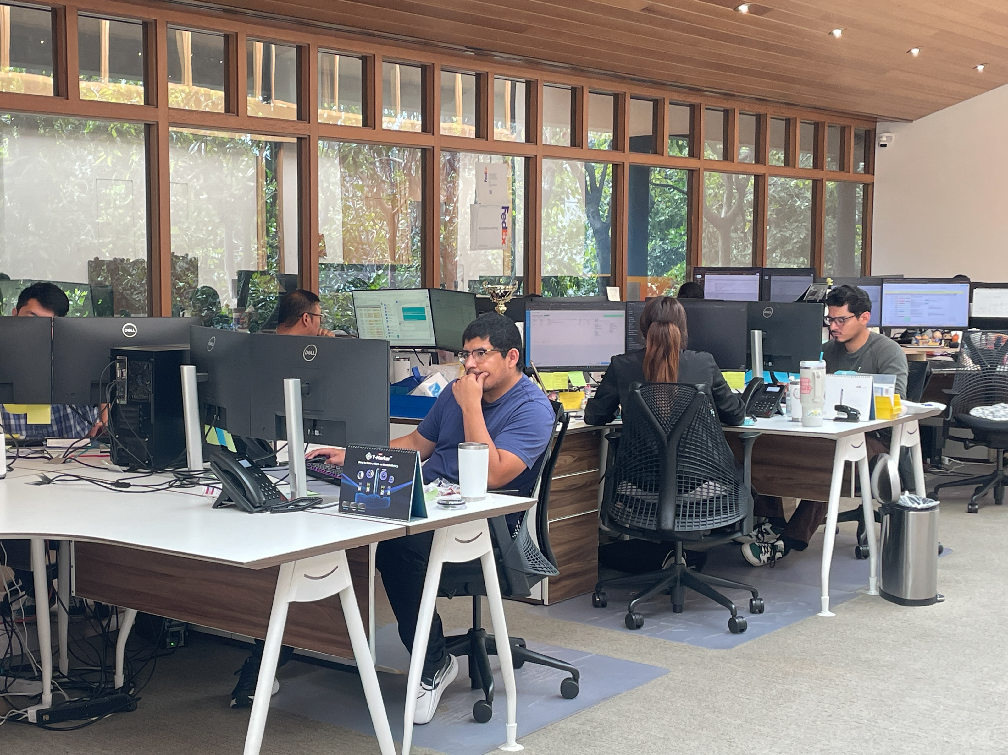 TruAbutment's in-house support team — the front line behind every ticket.
Customers reached out through Contact us, and reading those tickets in the admin surfaced what analytics couldn't:
“I don't know which app I should install.”
“Where do I find my notifications?”
“I came here to download sample data.”
The same confusion surfaced again and again — people were unsure where to go the moment they arrived. Those complaints are where the registration redesign began.
Every problem we uncovered deserved a real answer.
Users dropped off before they even started — confusing, off-brand copy and small frictions that piled up. I mapped the flow, talked to users, and looped in legal to make sign-up feel guided, not lost.
The product did more than users realized. I let the data lead — analytics showed what people reached for and what they skipped — then ran a RICE prioritization to rebuild the roadmap around what earned its place.
The launcher and the web read as two different products, and that gap eroded trust. I built a cross-platform design system from the ground up — brand-rooted, Atomic Design, accessible by default. One language, every surface.
The brief looked straightforward — until it wasn't.
The more we dug in, the more the problems multiplied — no shared definition of what "better" even meant. The Double Diamond became our alignment tool: diverge in Discover, converge to define what mattered, then do it again in development — exploring wide, then committing hard.
Explore wide, then commit — twice: once on the problem, once on the solution.
Where the diamond pointed
It closed with five clear priorities — each earned through research, not assumption.
Rebuilding the structure.
I mapped the launcher end to end — every screen, state, and pop-up — then restructured it into seven clear areas, each with a reusable template underneath.
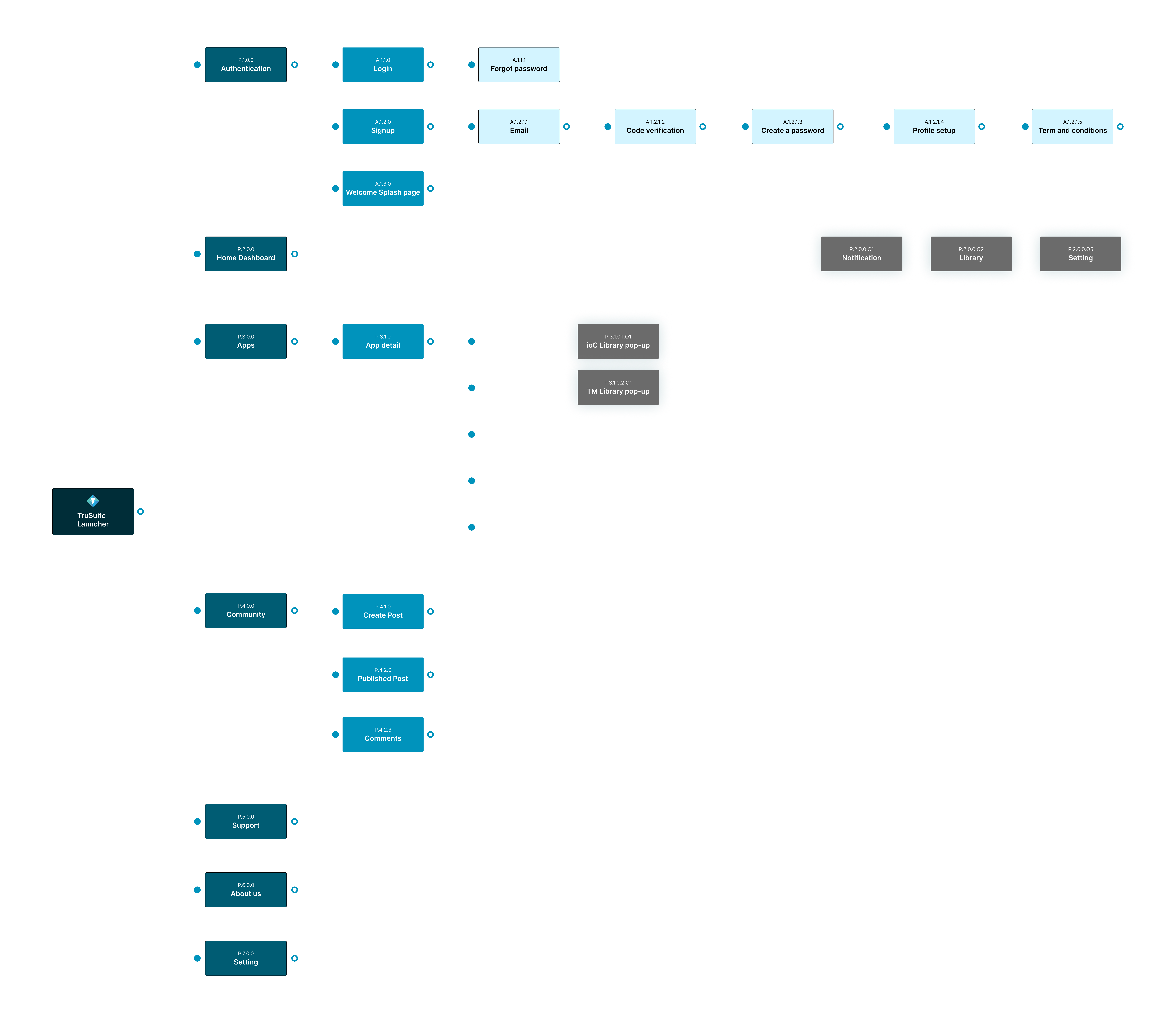
FIG. — Full sitemap: 7 top-level areas mapped in Figma.
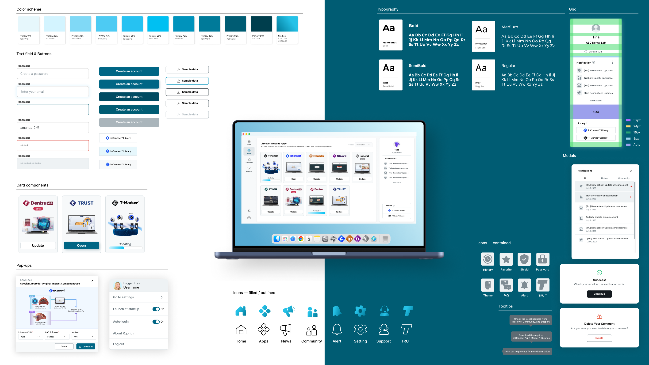
One language, every surface.
A cross-platform system built from the ground up — color, type, spacing, components, and iconography — structured with Atomic Design so the launcher and the web finally read as one product.
Priorities, made real.
Each priority from the diamond, executed screen by screen.
A guided way in
Registration — once confusing and off-brand, where users dropped off before they even started — became a calm, guided path.
FIG. — Registration flow: old vs redesigned.
One template, every app
Features that were buried became easy to find — every app opens into the same clear detail template, so discovering, downloading, and managing tools finally feels effortless.
FIG. — App detail page.
A community worth returning to
The social layer sat near-zero. I rebuilt community around posting, sharing, and conversation — a reason to come back beyond a one-off download.
FIG. — Community.
It shipped — July 31, 2026.
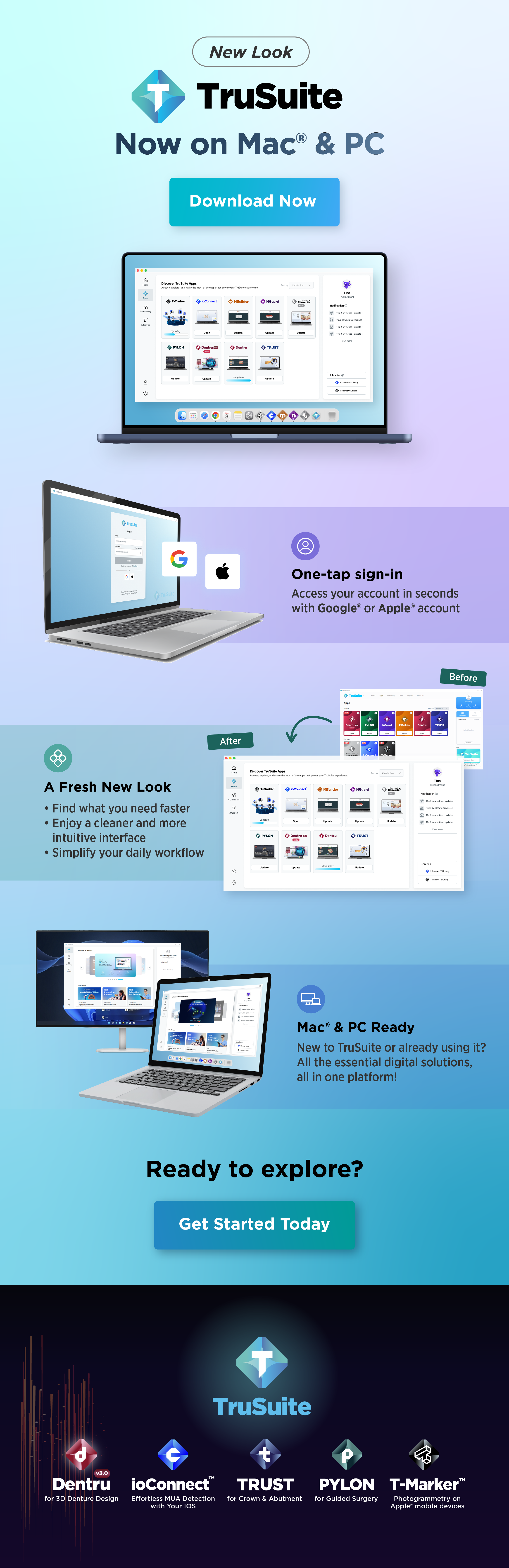
The redesign launched alongside a new Mac version, backed by a full campaign. Banners I designed ran across every web platform, and an Eblast went out to walk users through the new features and design.
For the launch content, I worked with the PM team — helping write the copy for the new social features and the usability improvements the redesign introduced. It's live today, and I'm still shipping against it.
Beyond the product, I designed the launch push — web banners for desktop and mobile and the announcement Eblast — partnering with the PM team on the copy so the story landed the same way everywhere.
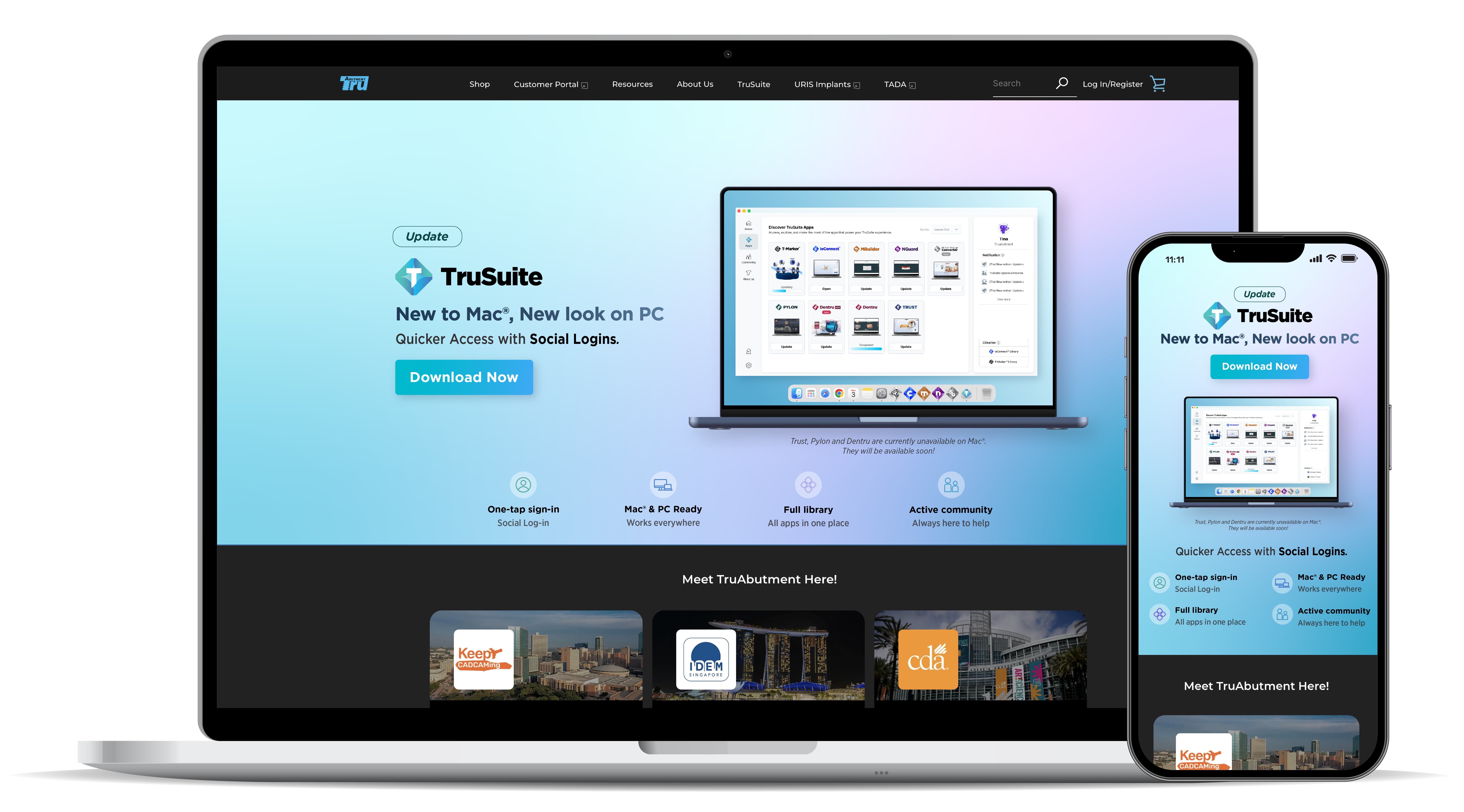
Launch promo banner
Mac version — scroll to view
What building it taught me.
This was one of the biggest projects I led at TruAbutment — and the hardest, most rewarding part wasn't the design. It was working directly with the dev team and aligning every stakeholder around it. Everyone knew the old launcher was a problem, but no one had pinned down what was broken, how to fix it, or who would lead. One thing I love about a startup is the chance to own the work you want to take on — and this was that project for me. I could see the blueprint, and I was confident going in.
It was harder than I expected. The dev team was overseas, so every feasibility check came with a lag. The launcher was already live, so nothing could be designed without accounting for the existing backend. And every decision had to be sold to stakeholders — moving the navigation, capping banners at six and matching their size to Tru's web platform weren't just launcher-user calls. They had to work for the developers who run it, the marketing team who manage its content, and the internal customer-service and digital-solution teams who pull the sources they need.
As a designer focused on the front end and usability, I assumed we could ship everything within six months. The dev team saw it differently — so I proposed a phased release: an MVP first, then second and third updates. That compromise is what got us out the door.
Building one system and getting everyone to agree on it wasn't easy. But the dev team and I communicate far better now than when we started, and I've learned that communication is what decides whether a project succeeds — so whenever they needed something, I followed up as fast and precisely as I could across the time difference. Those small efforts, stacked up, are what let us launch. (When one of the developers was promoted mid-project, I designed new business cards for them with the new title — unrelated to the work, just my own way of celebrating.)
Still shipping.
After launch, the dev team and I mapped what should come next and set priorities: a responsive layout, a My Favorites feature, and a backend page that lets marketing manage content on their own — instead of routing every change through engineering. I'm designing those now, while keeping a steady loop open with the dev team on fixes and issues in the live launcher.
With our working styles and communication finally in sync, I'm optimistic the second and third updates will land smoothly. There will be new challenges — but I'm looking forward to a launcher that keeps getting more usable.
See it for yourself.
The TruSuite Launcher is live today — download it and take the redesign for a spin.
Download the launcher ↗