One brand, every campaign.
Events, launches, and product promotions for TruAbutment.
Banners, social, email, and print — dozens of pieces, each tuned to its moment, all unmistakably one brand. Scroll to see the range.
Trade shows, live surgery courses, webinars, product launches — each promotion had to feel native to its channel and speak to its audience, while laddering up to a single TruAbutment identity. I designed the promotional creative across social, web, email, and on-site print — flexing the system per campaign without ever losing the brand.
- Event & campaign promotion
- Social media content
- Email (eblast)
- Web & product banners
- On-site print signage
- Graphic Designer
- Campaign creative
- Adobe Illustrator
- Adobe Photoshop
- Adobe InDesign
- Multiple campaigns
across 2025–2026 - Concept → delivery
Different every time — always TruAbutment.
The work spans loud event posters and clean product banners, but the same visual language runs under all of it: a blue-anchored gradient, an electric-blue-and-navy palette, white-outlined cut-out photography, bold headlines with a single italic accent word, and a rounded pill CTA. Loose enough to give each event its own energy; tight enough that everything reads as one company.
to Remember
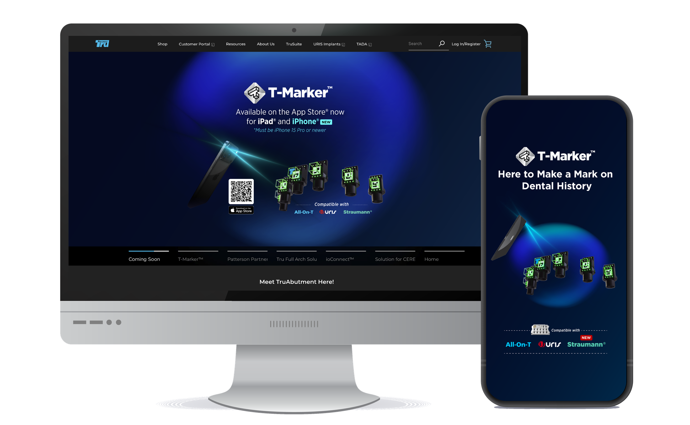
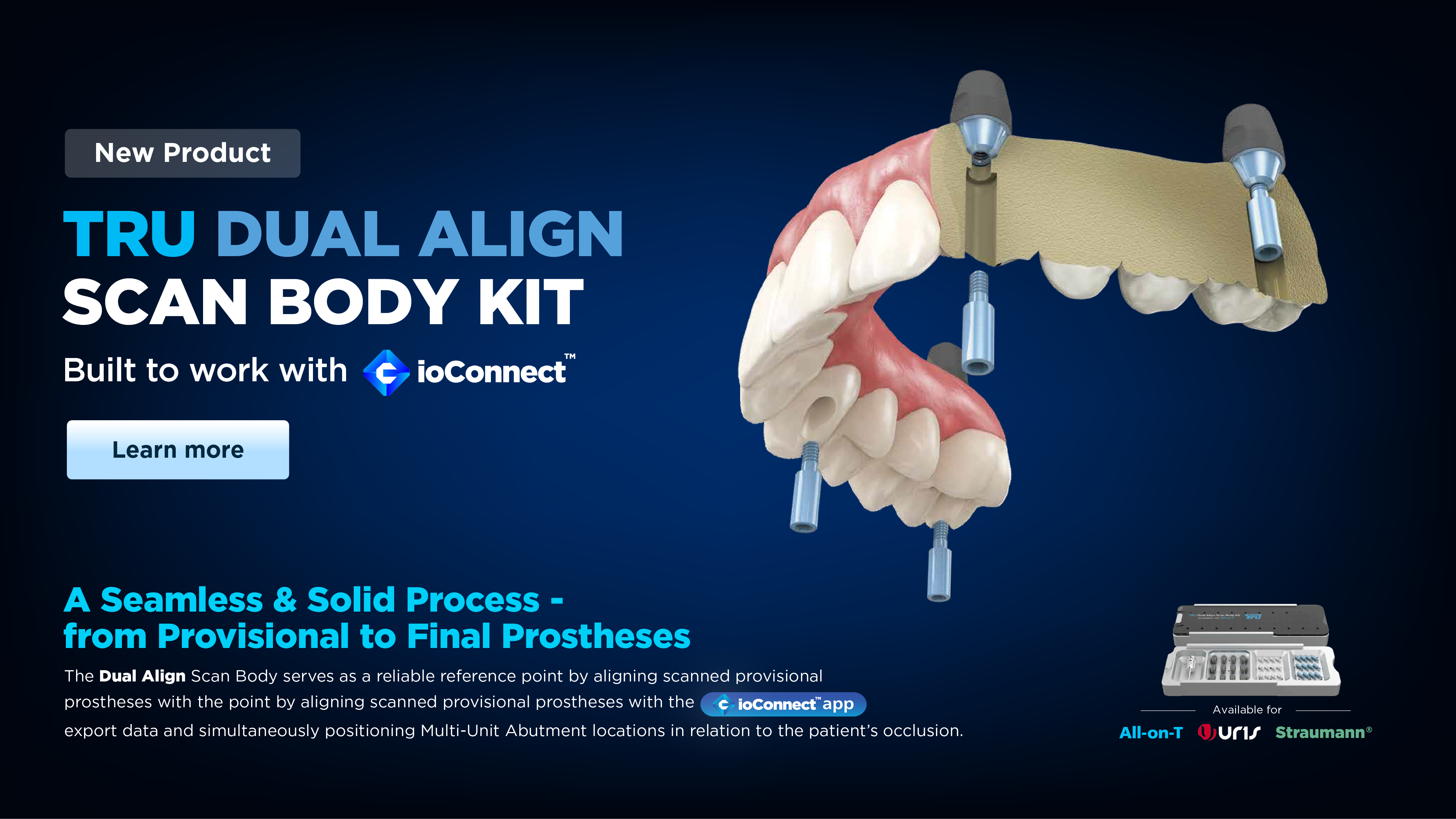
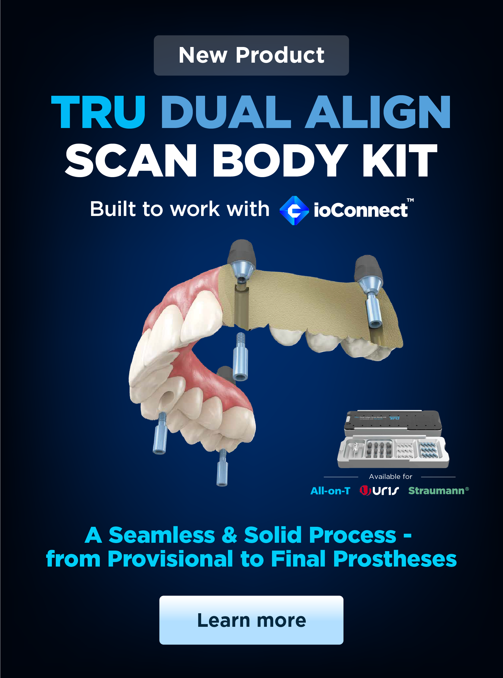
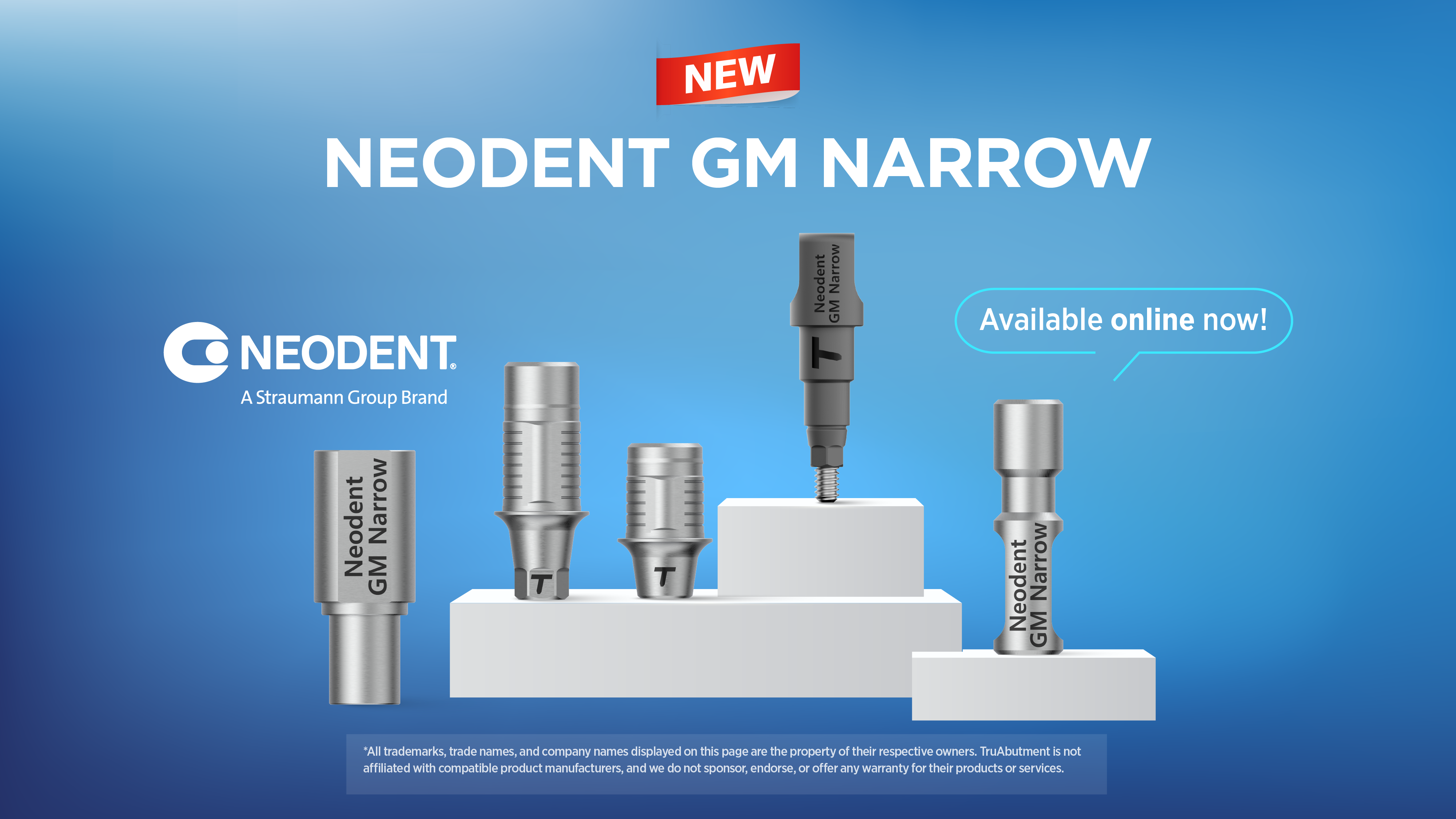
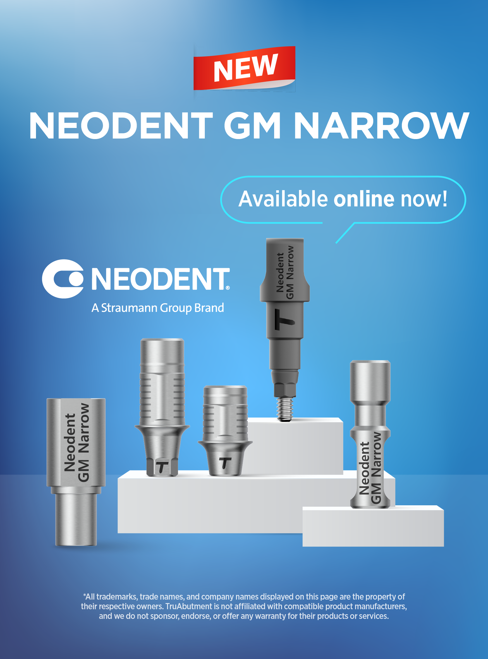
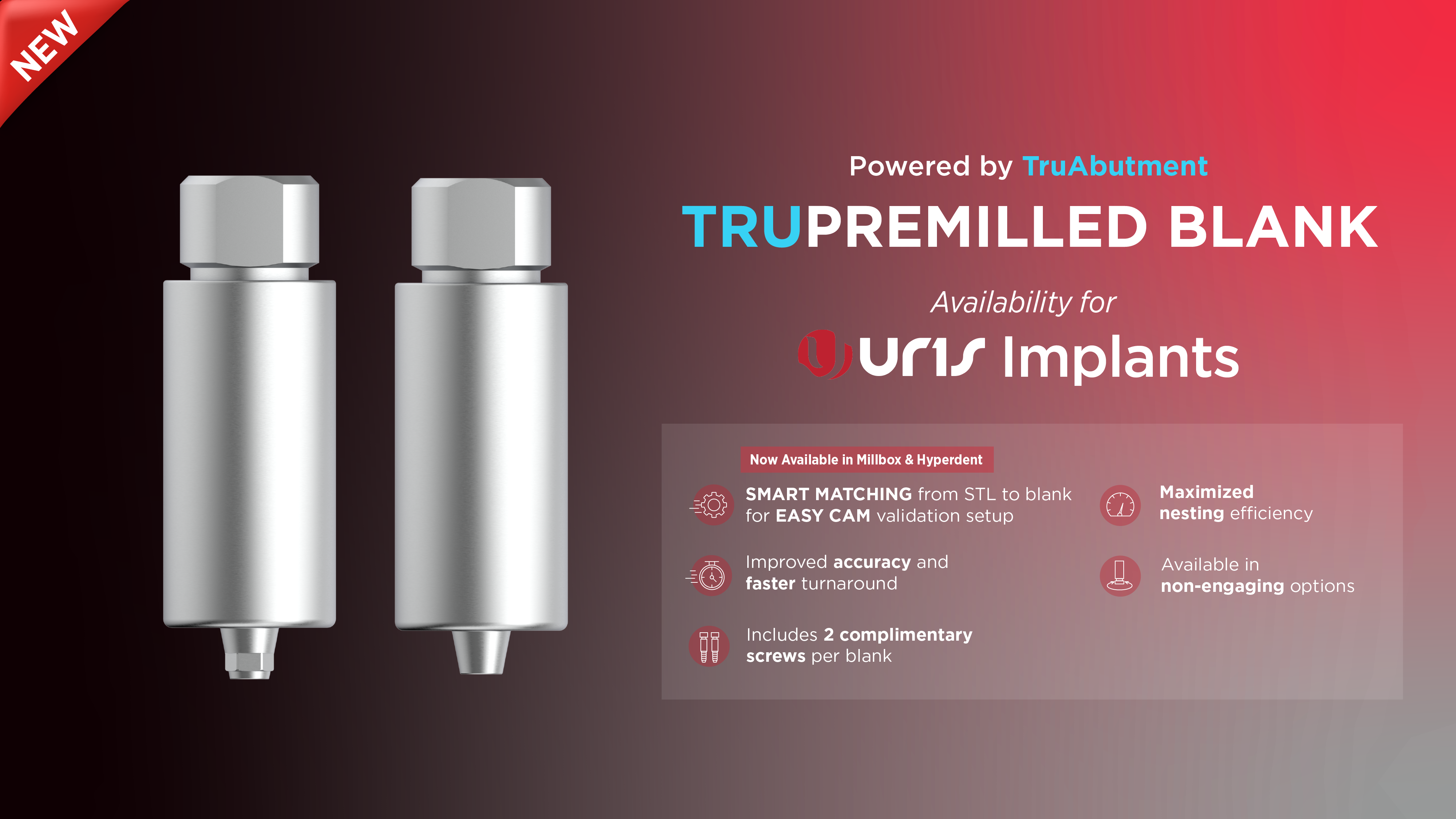
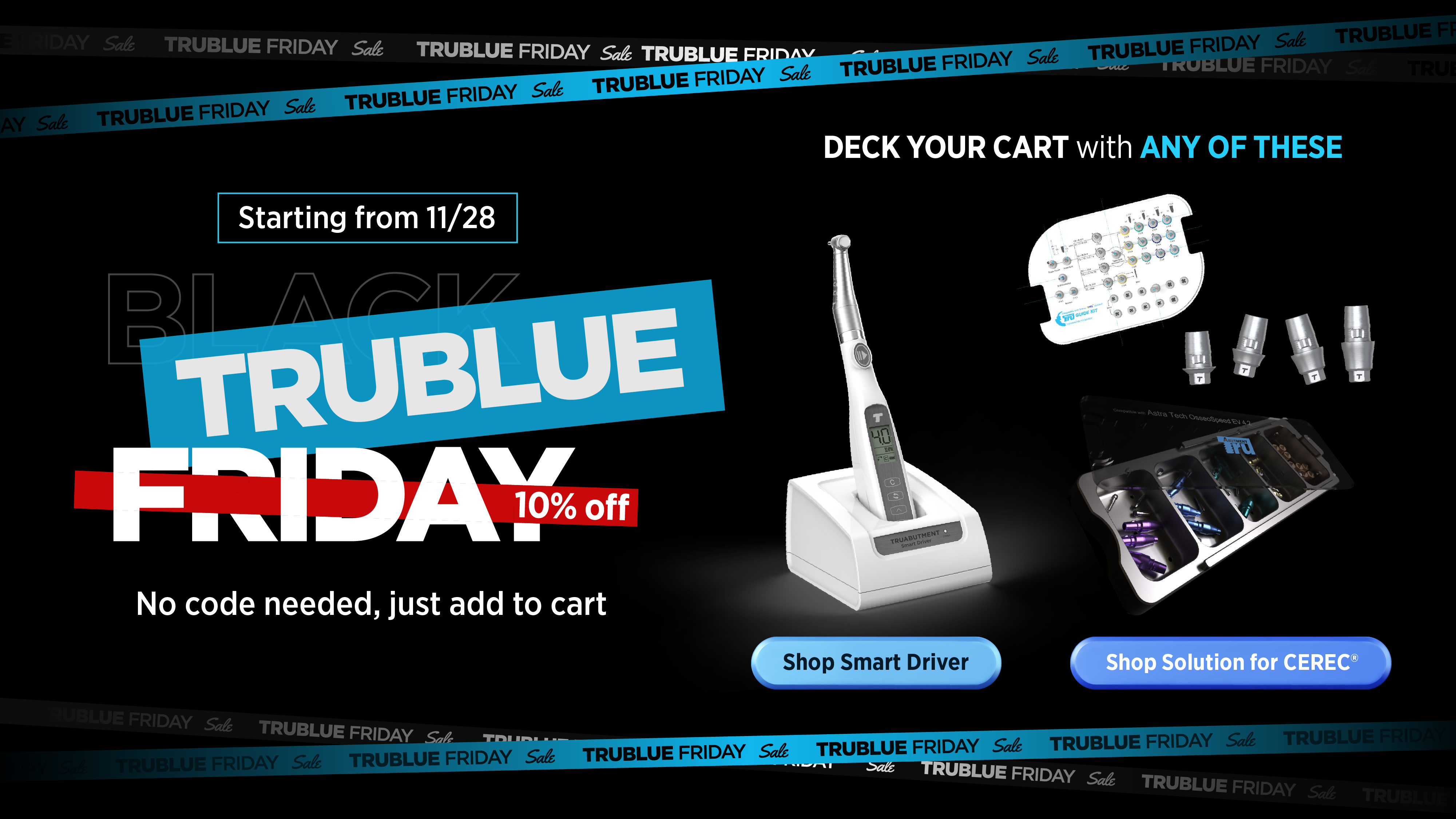
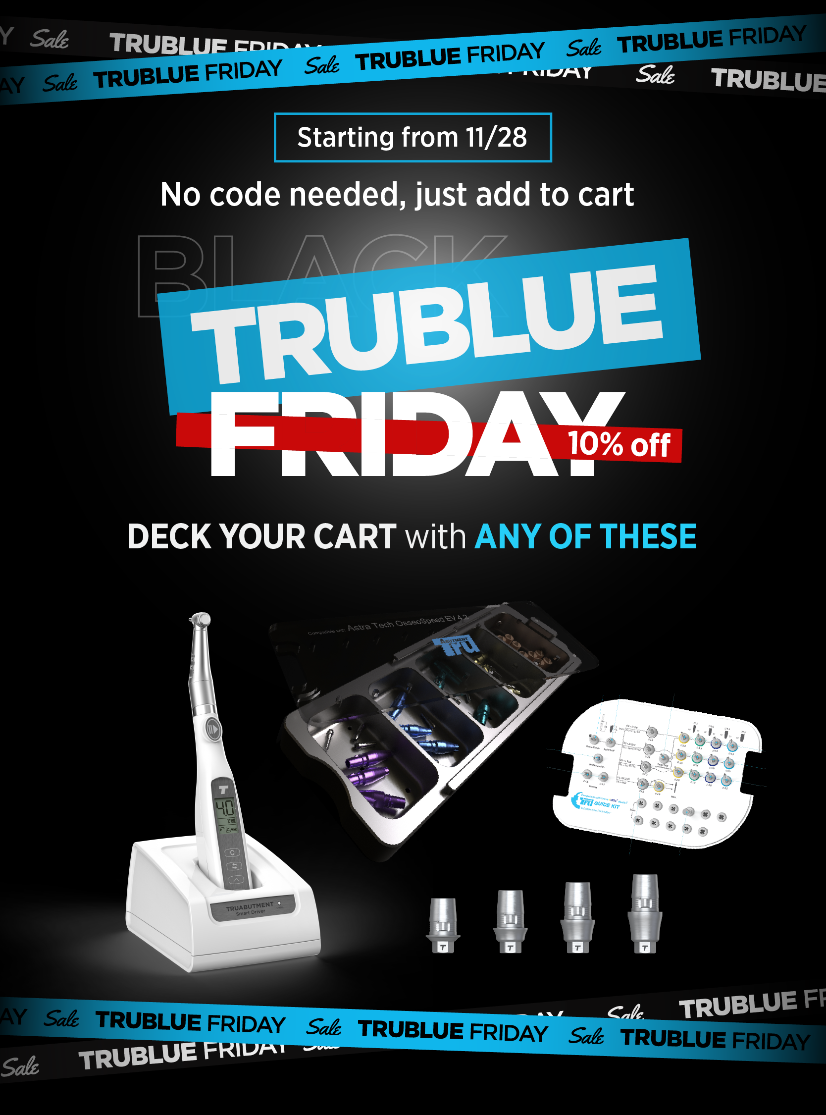
Shopify storefront banners
A steady run of banners for TruAbutment’s web store — each designed responsive, with matched desktop and mobile layouts sized to drop straight into the Shopify theme. Two jobs: launching new products, and running seasonal promotions.
One brand, every placement.
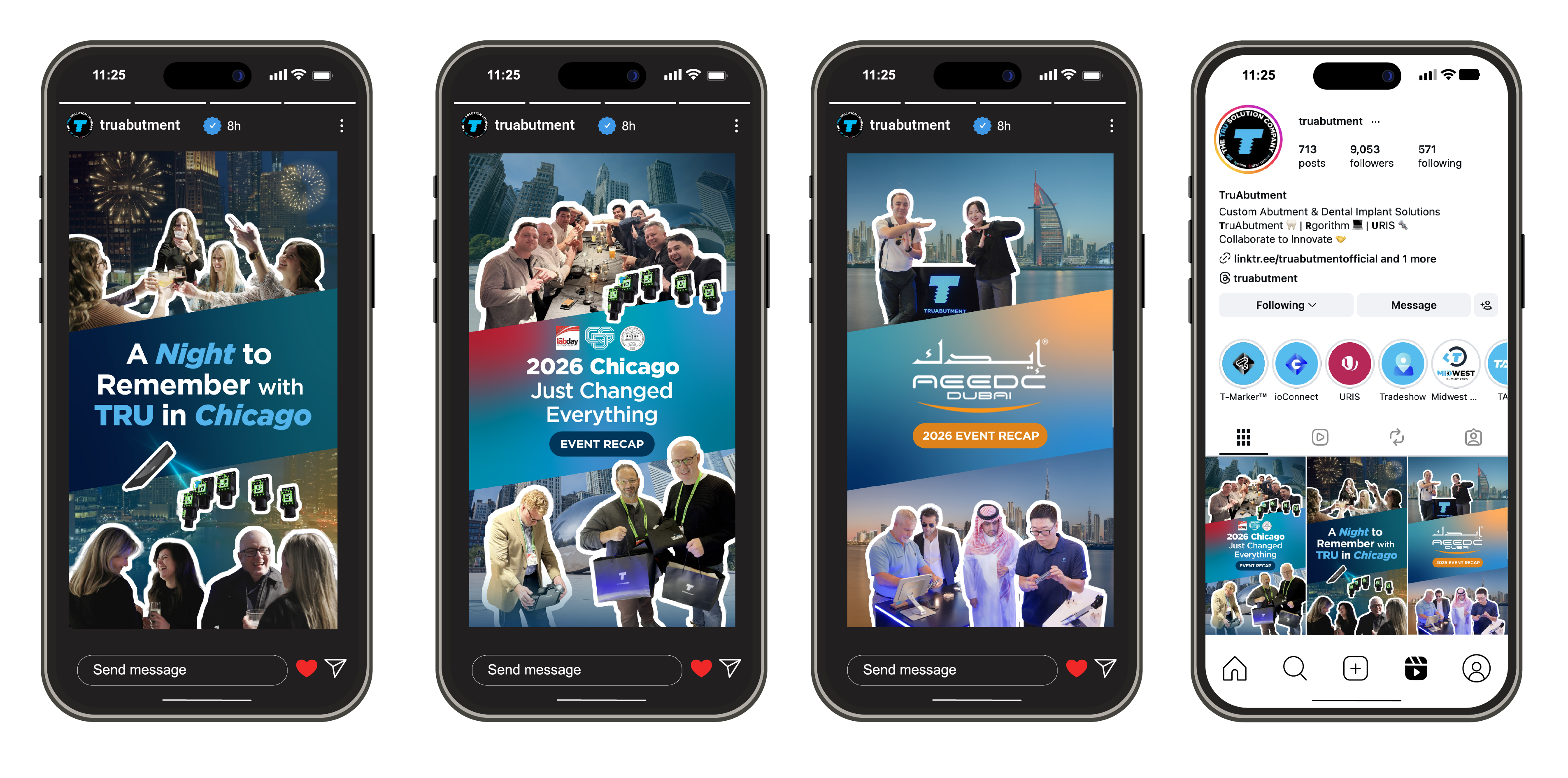
The same visual language, recomposed for wherever it ships — a full Instagram feed, Facebook, event banners, and email. Not resized — re-laid-out for each. Tap through the formats:


YouTube thumbnails
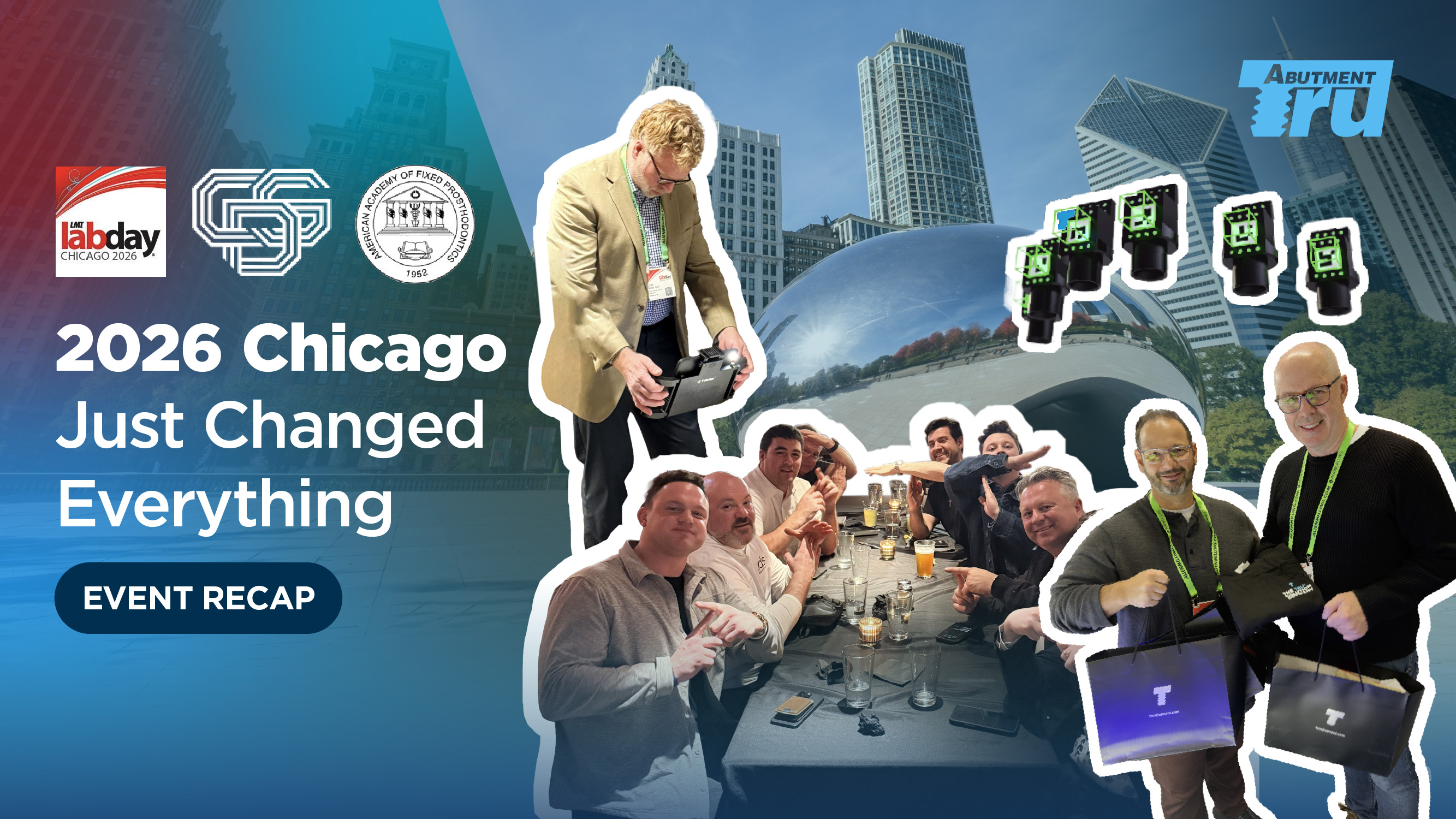
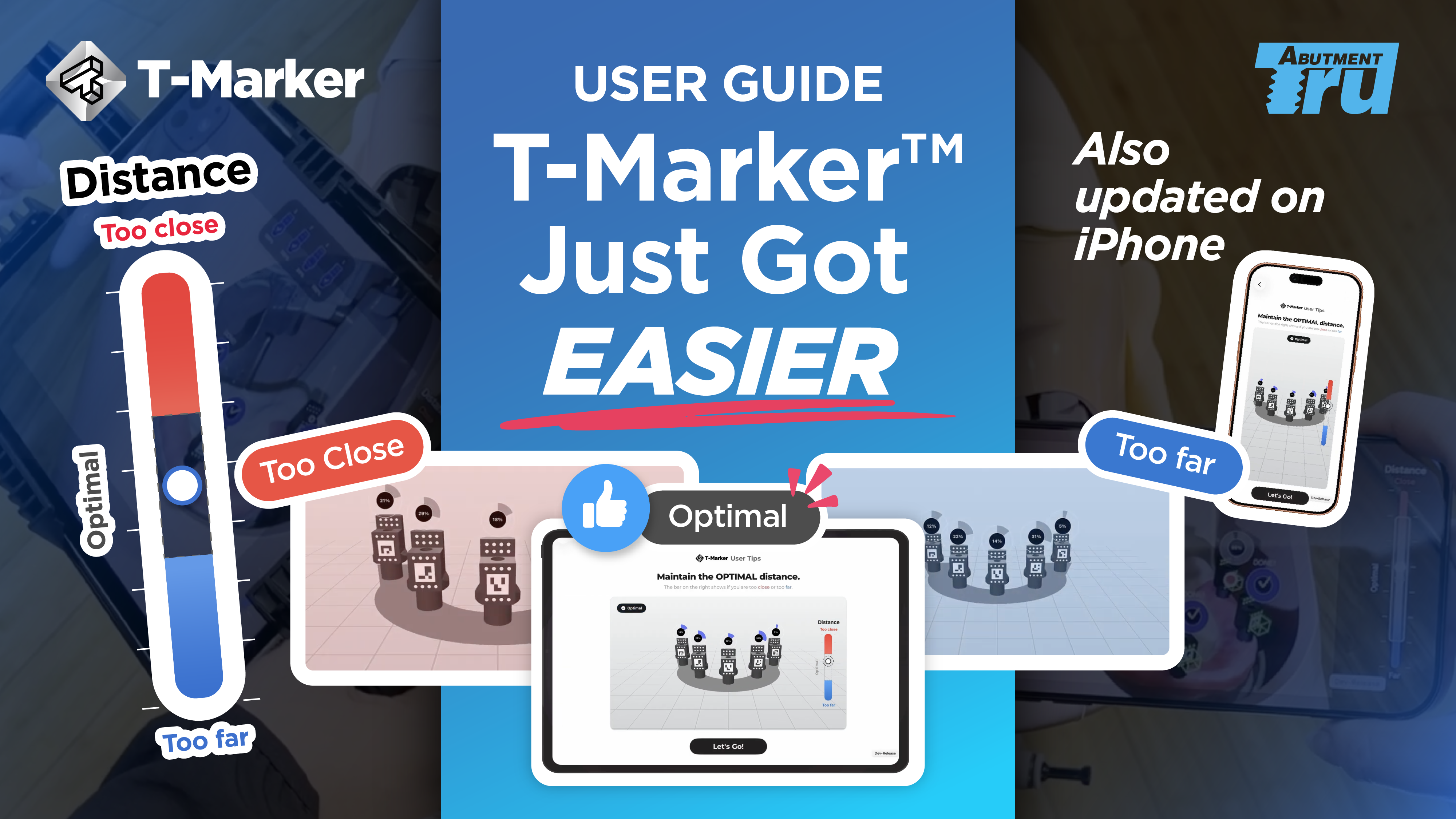
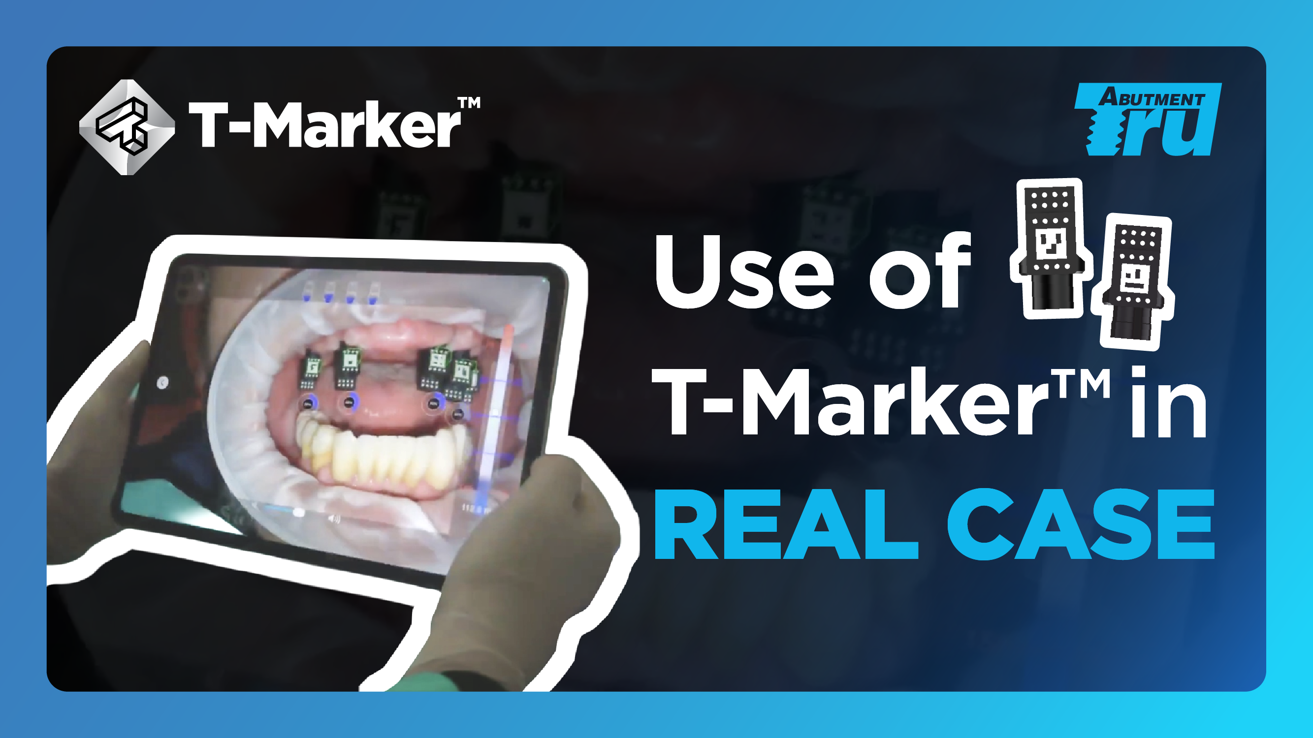
Thumbnails built to earn the click — designed to read at a glance beside a title, and to hold together as a set across the TruAbutment channel. Tutorials, event recaps, and product explainers.
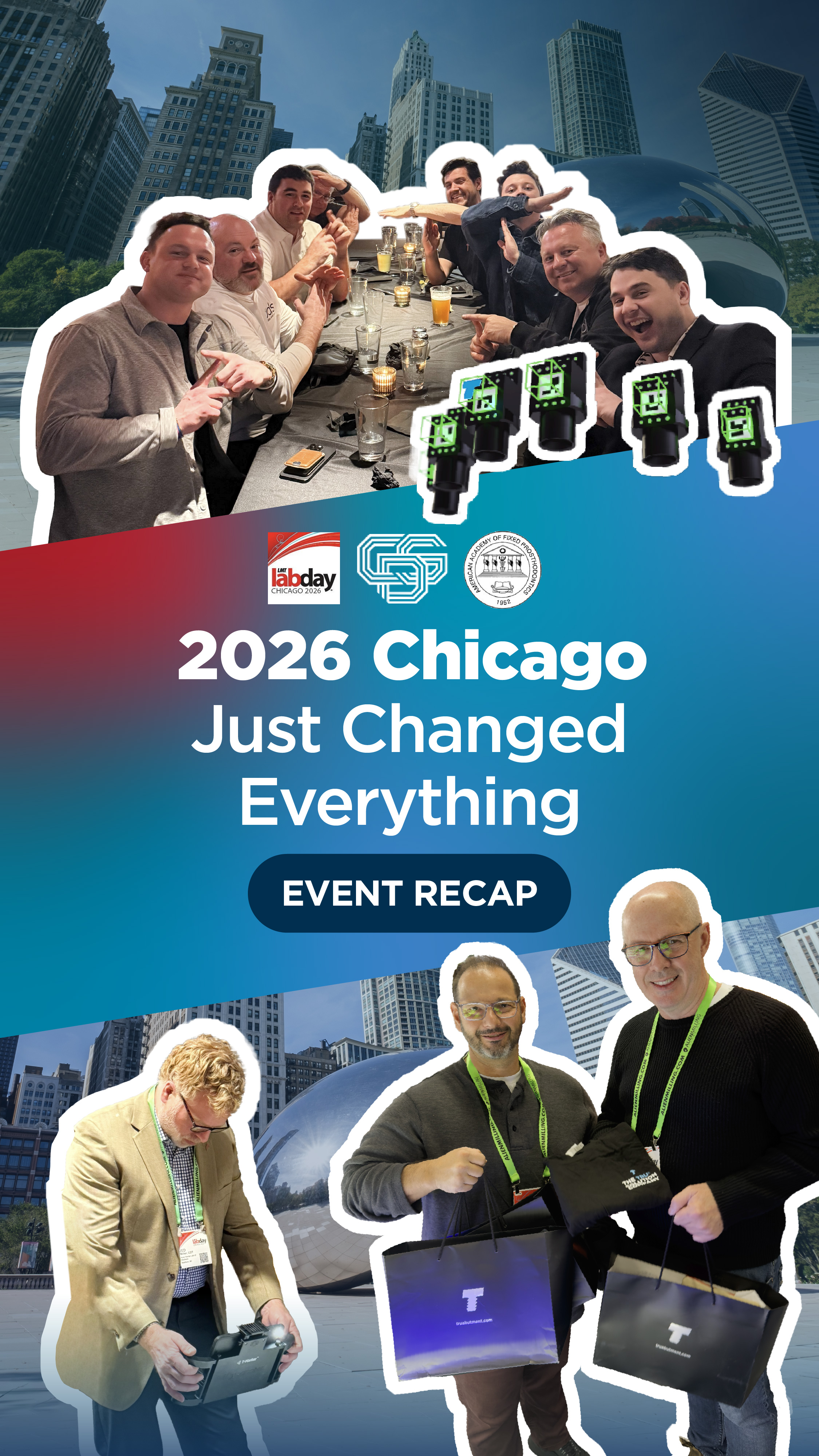 Reels
Reels
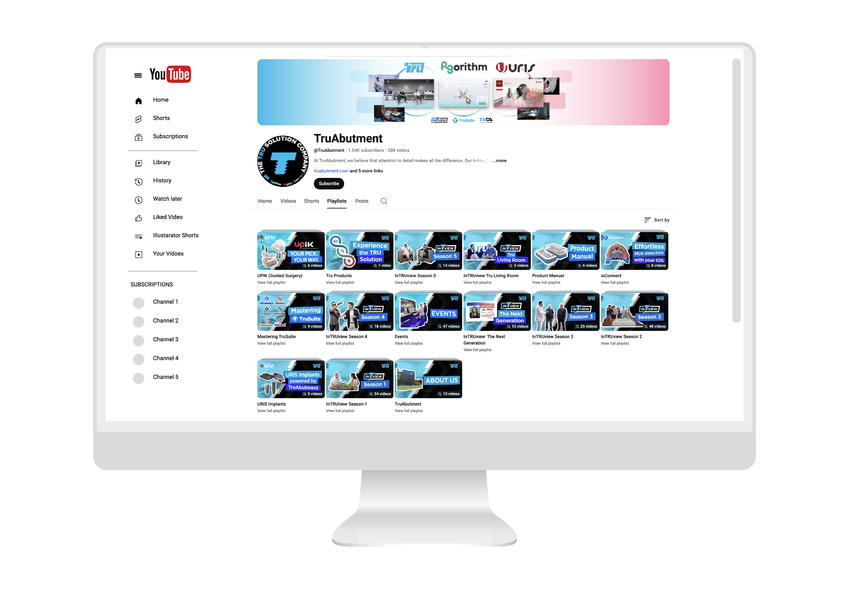
The channel’s playlists were sorted by topic, but they didn’t read as one branded, organized system. I designed a thumbnail for each — capturing what makes that series distinct — so the whole shelf feels unified while every playlist still speaks to its own subject.
The work moved the numbers.
Instagram Reels views, @truabutment · event-recap series
Every piece is different. None of them looks like a different company. That balance — range without drift — is what I bring to a brand producing marketing at volume.